 Connect
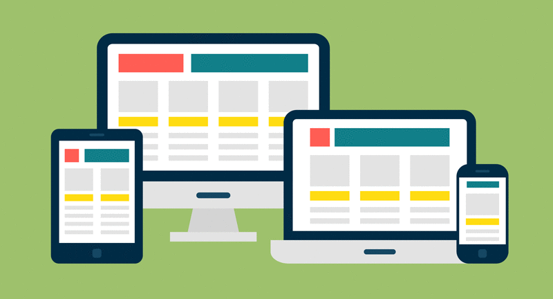
You may of heard the term responsive website design but may not be sure what it means.
Responsive design means a web page will display appropriately in a desktop web browser (e.g. Internet Explorer), a tablet web browser, and a smart phone web browser.
The web page will have been designed so that the web page adapts to the device width.
The search engine Google decided to optimise its search results so that websites that are mobile friendly (another term for responsive design) receive a bonus in the search results, compared to websites which are not mobile friendly.
A good way to test to see if your website is mobile friendly is to open your website in a desktop/laptop web browser, and start resizing the window smaller and smaller to see if your website adapts to the smaller window width.
If some of your content is cut off to the right of the right window edge, you know the website is not responsive.
It is normally a small to medium task to make a website mobile friendly (to provide a responsive design). If you’d like our help, feel free to contact us below.
Grab the free e-book "How to Write Copy That People AND Search Engines LOVE" so you can keep people on your page and rank highly on Google
If you would like some more information on how to leverage the latest trends for your business, contact Steve at insight.web@insightdesign.com.au or call 08 9381 5900
.