 Connect
Webflow Website Builder Guide
Introduction
Webflow is a great website builder that provides in-depth ways to fine tune the appearance of your website. It has a user interface very similar to Adobe Photoshop, and allows you to heavily customise every aspect of your page without any knowledge of HTML.
Webflow offers four kinds of plans.
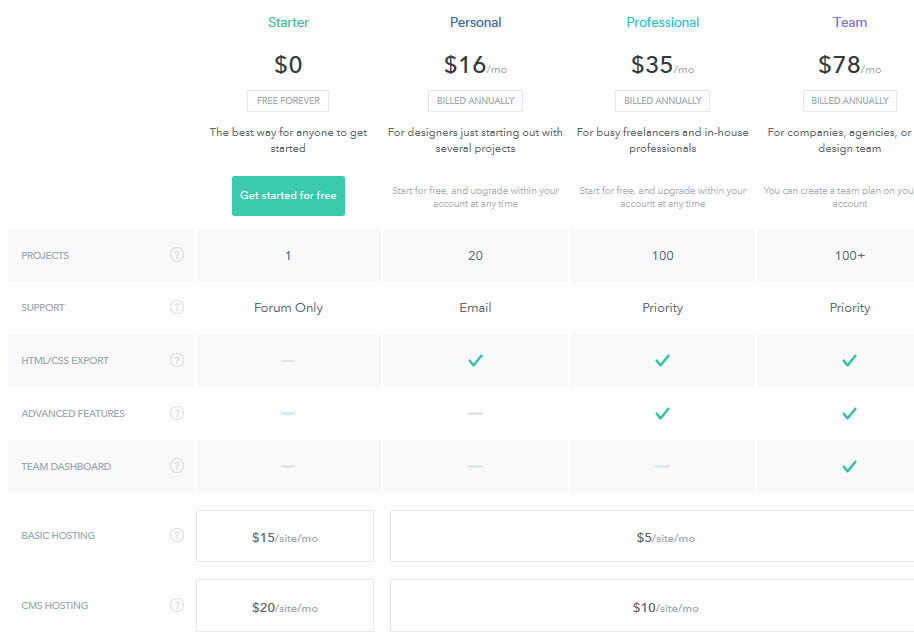
Figure 1: Webflow plans.
The starter plan is free. You can create one project, and only receive forum support. You can also do basic hosting for $15 a month, or CMS hosting for $20 a month with this plan. The personal plan is $16 a month. With this plan, you can create up to twenty websites, and get email support. You can also export the HTML and CSS from the page. The basic hosting for this plan and up are $5 per site per month, and the CMS hosting is $10 per site per month. The professional plan is $35 a month. With this plan, you get up to 100 projects and priority support. You now also get the addition of advanced features. Finally, there is the team plan for $78 a month. The difference here is that you now get a team dashboard.
Once you’ve decided on what plan works best for you, it’s time to get started!
Getting Started
First, it’ll ask you to choose your website’s visibility (public or private), the website’s name, and the template. You can sort your templates to show all, free, or premium. You can also choose only certain types (all, basic, or CMS) and categories (event, blog, business, entertainment, nonprofit, personal, portfolio, other). Finally, you can choose how they’re sorted (featured, created date, price, or popularity). For each template, if you hover over it, you can choose to preview it or see the features that it has. Preview will show you a faux fully functional site with that theme. Features will tell you the categories this template fits into, a description of what this template works best for, and the option to use or purchase this template (along with the price, if any). Below, you’ll also find a list of features, license, and support. Click on any of the templates to select it for your site. You can also choose a blank template. When you’re ready, hit on “Create Your First Website.”
Editor
Once you’ve chosen a template, you’ll get an editor that looks like this:
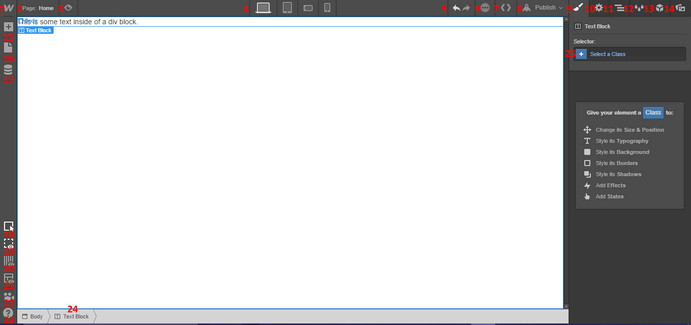
Figure 2: Editor Menu.
- Access your dashboard, site settings, and editor.
- Manage your pages, or switch the page that you’re currently editing.
- Toggle preview.
- Change the view. Switch between desktop, tablet, mobile landscape, and mobile portrait.
- Undo or redo last change.
- Shows if your changes have been saved (green check mark).
- Export code.
- Publish your website/choose a domain. Your default name will be site-name.webflow.io
- Brings up style menu.
- Brings up body settings.
- Brings up navigator.
- Style manager.
- View global objects.
- Asset manager.
- Add element.
- Another way to bring up your pages menu.
- Bring up your collections.
- Hide element edges.
- Hide empty elements.
- Show light grid overlay.
- Enable x-ray mode.
- Video tutorials of how to work Webflow.
- Access various help options. There is: help center, video tutorials, courses, forums, keyboard shortcuts, and contact us.
- Displays the element you currently have selected.
- Select a class for your current element.
Elements
Each element will use the “Settings” tab to modify its particular settings. To modify the settings for a large group of elements, create and modify a class in the “Style” tab.
Layout
Section
Creates a full-width section on your page. You can use this to create a group of items that all have the same formatting by giving the section a class. For settings, you can choose an ID, a tag, the visibility on different devices, custom attributes, and if collaborators can edit this. These are settings options available for all elements. Its custom attributes are for <div>.
Container
Creates a container sectioned off on your page. There are no special settings for this option. Its custom attributes are for <div>.
Columns
Creates a full-height column on your page for sectioning off.
- Choose how the columns are laid out for desktop
- Choose whether each of those columns are the same size or varying sizes by sliding the centre bar. Depending on the layout you choose, this will appear differently.
- This lets you choose how you want the columns to appear on tablets. The default flips the columns into rows.
- This lets you choose how you want the columns to appear on phones in landscape mode.
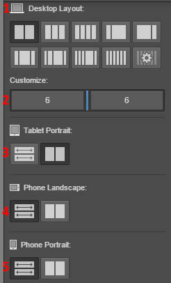
Figure 3: Columns settings
- This lets you choose how you want the columns to appear on phones in portrait mode.
Its custom attributes are <div>.
Div Block
Create a divider block into which you can add content. There are no special settings options for this element. Its custom attributes are <div>.
Link Block
Create a link on your page.
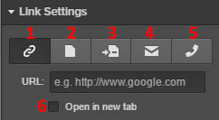
- Link to a URL.
- Link to a different page on your site.
- Link to a section within this page (so the user is automatically scrolled down or up to that position).
- Link to an email address (and choose the default email subject).
- Link to a phone number.
- Open the link in a new tab.
Its custom attributes are <a>.
Button
Create a button on your page that links to something. Because it, too is a link, it has the same options as the link block. Its custom attributes are <a>.
List
Create a list on your page. You can choose if it is ordered (numbered), or unordered, and whether or not it has bullets. It automatically comes with three list items, but you can delete them if you don’t want them. Its custom attributes are <ul> for unordered list, or <ol> for ordered list.
List Item
Drag to your list to add another item. Its custom attributes are <il>.
Typography
Heading
Add a heading to your page. You can choose the heading type (H1 to H6). Depending on which you choose, its custom attributes are <h1> through <h6> attributes. To change the words, double click within the box.
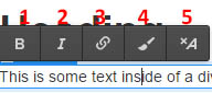
Figure 5: Standard text options
- Bold
- Italicize
- Add a link.
- Wrap box size to text length.
- Remove all formatting.
Paragraph
Add a large block of text to your page. Its custom attributes are <p>. It has the same standard text options.
Text Link
This lets you add a link that appears with a different text description than what you are linking to. Its custom attributes are <a>. It has the same standard text options.
Text Block
This lets you add a block of text to your page. Its custom attributes are <div>. It has the same standard text options.
Block Quote
This lets you add a block of text to your page. Its custom attributes are <blockquote>. It has the same standard text options.
Rich Text
This allows you to create all of the above options within one rich text option, as well as add images. You drag the other elements to fit within the rich text box, and then set it so that their class has different settings when nested inside of a selection. Its custom attributes are <div>.
Dynamic Content
Dynamic List
Create a dynamic list. This lets you add collections to each member of the dynamic list. For each collection, you can change which collection the list contains, the state (with items or empty), the layout of the list (columns or rows), the filters, and the sort order. Its custom attributes are <div>.
Media
Image
Add an image to your page.
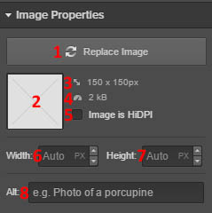
Figure 6: Image properties
- Change the image you have here.
- A display of your image will appear here.
- The original size of your image.
- The size of your image.
- Choose if the image is HiDPI
- Set the image width.
- Set the image height.
- Change the alt text.
Video
Add a video to your site. Your properties will ask you to input the video URL that you wish to display. Its custom attributes are <div>.
Form Block
This allows you to create a form on your page.
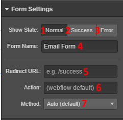
Figure 7: Form settings
- Change the form’s normal state.
- Change the form’s success state (once it has been submitted).
- Change the form’s error state (if someone hits submit and the request doesn’t go through)
- Change the form’s name.
- Choose the redirect URL for this state.
- Choose the action for this state.
- Change the method of this state (auto, get, or post).
Clicking on each state will display the form in that state as well for modification. You can then modify the elements of these states directly on the form. Its custom attributes are <div>.
Label
Add a label to your form block. Its custom attributes are <label>.
Input
Insert an input field into your form.
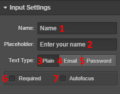
Figure 8: Input settings
- Change the field’s name.
- Change the placeholder text (the default text that appears in the input field).
- Set the text type that the user will be inputting to plain.
- Set the text type as email.
- Set the text type as password.
- Set if the field is required.
- Set if the field is autofocused.
Its custom attributes are <input>.
Text Area
Insert a text area into your form. It’s like an input form but with more space. It has the same options as the input field, without the option for text type. Its custom attributes are <textarea>.
Checkbox
Add a checkbox to your form. You can choose the label on the checkbox, if it is required, and if it is checked by default. Its custom attributes are <div>.
Radio Button
Add a radio button to your form. You can choose the name of the group that button belongs to, the name of the choice, and whether or not it is required. Its custom attributes are <input>.
Select
This allows you to add a dropdown box to your page.
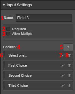
Figure 9: Select settings
- Name of the dropdown menu.
- Choose whether or not this field is required.
- Allow the user to select multiple choices.
- A list of the choices the user has in their dropdown menu.
- Add a new choice option.
- Drag here on the left to rearrange the choice options.
- Edit this choice option (choose the text for the option and the value of the option).
- Delete this choice option.
Its custom attributes are <select>.
Form Button
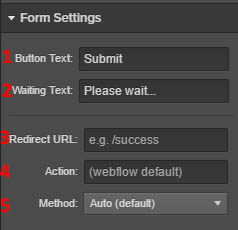
Figure 10: Form button settings
- Button’s text.
- What the button says while the form is being submitted.
- What the button redirects to.
- The action of the button.
- The method of the button.
Its custom attributes are <input>.
Components
Tabs
This lets you add a tabbed view to your page.
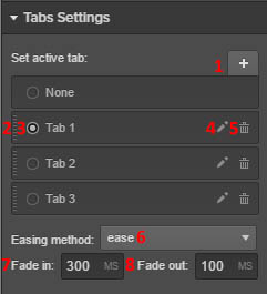
Figure 11: Tabs settings
- Add a new tab.
- Drag from here to rearrange the tab order.
- Use the radio buttons to select the currently active tab.
- Edit the name of the tab.
- Delete the tab.
- Choose the transition between tabs.
- Choose the fade in time for tab switching.
- Choose the fade out time for tab switching.
The tab overview’s custom attribute is <div>, and the individual tab custom attribute is <a>.
Navbar
This lets you add a navigation menu to your page.
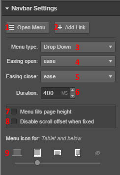
Figure 12: Navigation menu
- Open menu (so you can edit the links on the navigation bar).
- Add a link to your navigation bar.
- Choose the menu type (drop down, over right, or over left).
- Choose the menu opening transition
- Choose the menu closing transition.
- Choose the transition duration.
- Choose if the menu page fills the entire page length in height.
- Choose to disable the scroll if you have the menu fixed.
- Choose the platforms this menu will appear for (desktop, tablet, phone landscape, and phone portrait).
Its custom attributes are <div>. The navigation links are attribute <a>.
Dropdown
This lets you add a dropdown box to your page. You can choose to open the menu to view the different links within. You can also choose to add a link, decide the delay it takes to close the menu, and whether the menu automatically opens when one hovers over it (instead of having to click on it). Its custom attributes are <div>.
Slider
This adds a slide show to your page.
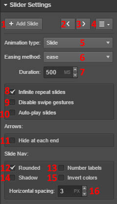
Figure 13: Slider Settings
- Add a new slide to your slide show.
- Go back one slide.
- Go forward one slide.
- Opens the navigator (so you can view a list of all slides).
- Choose the animation type when switching between slides (slide, cross fade, fade out to in, fade over, or slide over).
- Choose the easing method (ease in or out in different forms).
- Choose the duration a slide appears before it switches to a new one.
- Choose to repeat the slide show an infinite number of times.
- Disable the ability for users to use “swipe” gestures to switch between slides (on touch screens).
- Begin the slide show automatically.
- Remove the arrows on the slide show.
- Choose rounded circles at the bottom for slide navigation (without checking anything, they’ll be small squares).
- Choose to implement numbered labels over the slide navigation circles or squares.
- Place a shadow around the slide navigation circles or squares.
- Invert the colours of the slide navigator (instead of light grey and white, they appear dark grey and black, with white labelling instead of black if you have labels turned on).
- Choose the spacing between the navigation items.
You can insert text on your slide by double clicking on the slide and starting to type. Options to bold, italicise, insert link, or wrap with span will then appear. The sliders’ custom attributes are <div>.y\
Lightbox Link
Add in a Lightbox so you can display images or videos that will appear in a full-screen view. Upload photos or videos to your display using the settings. Then, you can rearrange the order on the left-hand size. You can also choose to link this lightbox to others (you will have to give them a group name). Its custom attributes are <a>.
Map
Insert a map onto your page.
- Enter the address you want your map to focus on (it can be an exact address, or a city).
- Choose the tooltip.
- Choose the amount of zoom on by default.
- Make it a road map.
- Make it a terrain map.
- Make it a satellite map.
- Make it a hybrid map.
- Display the scroll wheel on the map for users to utilise.
- Enable touch drag on the map for users to utilise.
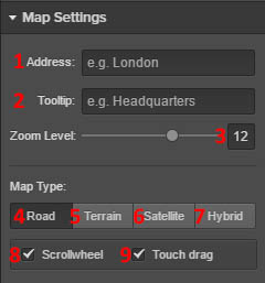
Figure 14: Map Settings
Its custom attributes are <div>.
Background Video
Use a video as the background on your page. Instead of providing a URL, you’ll need to upload a file in the format of webm, mp4, mov, or ogg, and it must be less than 30 MB. Its custom attributes are <div>.
Add a Facebook “like” button to your page.
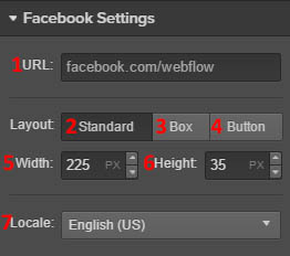
Figure 15: Facebook settings
- Choose the URL page that the user likes with the button.
- Choose if the button appears so the number of people who like it are displayed next to the button.
- Choose if the button appears so the counter is displayed above the button.
- Choose if the button appears so the number of likes is displayed as a part of the button.
- Determine the button’s width.
- Determine the button’s height.
- Determine the button’s locale (the language the button will appear in).
Its custom attributes are <div>.
Add a twitter button to your page.
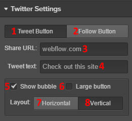
Figure 16: Twitter settings
- Add a Tweet button, where the button automatically creates a tweet for the user to approve as a post.
- Add a Follow button, where the user automatically follows an account of your choice. You can choose the user name on the follow button page.
- Add the URL displayed on the site when the tweet is created.
- Add the tweet text that will be displayed when the tweet is created.
- Show the bubble with the number of followers by the twitter button.
- Make the button large.
- Display the followers bubble next to the button.
- Display the followers bubble above the button.
Its custom attributes are <div>.
Embed
Embed HTML code on your page (only available with a premium plan).
Classes
To modify other aspects of your elements’ appearance, you’ll need go to the Style menu and create a class for the element. Then, you can give any element this same class, and it will have the same style formatting.
- Change the display settings of the outer block.
- Change the display settings of the inner block.
- Change the display settings of the inline. This option does not have top or bottom margins because they flow with the inline text.
- Change the flex layout. Change if elements in this class are displayed in a row or in a column. For either, you can choose to justify them at the start, at the centre, at the end, have space between, or have space around. You can also choose to reverse the directions of the elements. Finally, you can choose to wrap children relative to their parent with the same justification options.
- Choose to now display these elements.
- Modify the padding on each side of your element.
- Drag the arrows to change the padding.
- Drag the arrows to change the margins on each side of your element.
- Modify the margins individually.
- Centre the element.
- Modify the width of your element. You can also choose its minimum and maximum width.
- Modify the height of your element. You can also choose to modify its minimum and maximum height.
- Float all elements in a way that the text is to the right or left.
- Clear to the left and/or to the right.
- Choose how to manage overflow within your element. You can choose to hide it, scroll it, or have it automatically determined.
- Choose to position elements relative to one another, absolute positioning, or fixed positioning. You can choose to place it in a corer or along an edge. You can also choose to modify the margins, change the z-index, and position it a fixed distance from the parent element.
- Choose the font for this element.
- Choose the “weight” (read: boldness) of the font.
- Choose whether or not the font is italicised.
- Choose the colour of the font.
- Choose the size of the font.
- Choose the spacing between font lines.
- Choose the spacing between characters.
- Choose the indent amount.
- Choose the text alignment.
- Choose if the text is underlined or struck through.
- Display the text in all uppercase.
- Capitalise the first letter of each word.
- Display the text in all lowercase.
- Choose the text flow direction to be left to right, or right to left.
- Choose the number of text columns.
- Change the column settings. You can change the gap between columns, the column rule (line located between columns) color, the column rule width, and the rule style. You can also choose to change the settings separately of child classes nested within your main element.
- Add a background image to your element. You can select if the image is HiDPI, the width and height of the image, if it is a cover image or contained within a box, its position within your element, how multiple images are laid out (tile format), and if it is fixed.
- Add a gradient to your background.
- Overlay a colour on you background.
- If you choose one of the above three elements, it will appear here. You can then change the order in which it layered, if it is visible, and whether or not you choose to delete this item.
- Choose a background fill colour.
- Choose which side(s) your border will appear on.
- Choose the border style.
- Choose the width of the border.
- Choose the colour of the border.
- Choose which side(s) rounded borders appear on.
- Choose the radius (how rounded) the border is.
- Choose the type of box shadow. You can choose between drop shadow, outer glow, inner shadow, and add highlight. When you choose to add a shadow, you can choose the colour, angle, distance, and blur.
- The shadows you have are displayed here. You can drag them to rearrange the layered order they appear in. You can also choose if the shadow is visible, its colour, and whether or not you wish to delete it. If you click on the name, you can change its properties.
- Choose a shadow for your text. You can add a drop shadow, a letterpress shadow, and a letterpress highlight. When you choose to add a shadow, you can choose the colour, angle, distance, and blur.
- The shadows you have are displayed here. You can drag them to rearrange the layered order they appear in. You can also choose if the shadow is visible, its colour, and whether or not you wish to delete it. If you click on the name, you can change its properties.
- Add a new transition. You can choose to transition common, background, shadows, size, borders, typography, position, margin, padding, or flex options. You can choose the timing of the transition, as well as the easing method (linear, ease, ease in, ease out, or ease in and out).
- Your transitions will appear here. You can choose if it’s visible and if you want to delete it. If you click on the name, you can change its properties as well.
- Change the transform settings. Choose its origin, the perspective, and if “backface” is turned on.
- Add a transformation. You can change its movement (x, y, and z directions), the scale, its rotation, and its skew.
- Your transforms will appear here. You can choose if it’s visible and if you want to delete it. If you click on the name, you can change its properties as well.
- Choose if the children elements have a perspective relative to the parent. You can also choose the origin of the perspective angle.
- This lets you modify the pixel size of the perspective.
- You can set these same parameters for the parent class as well (as long as you have a parent class).
- Change the opacity of the element.
- Change the filters on your element. You can choose general, color adjustments, and color effects. You can also choose the radius of the filter.
- Your filters will be displayed here. You can choose if it’s visible and if you want to delete it. If you click on the name, you can change its properties as well.
- Choose the cursor type on this element. You can choose from general, links & status, selection, drag & drop, zoom, and resize.
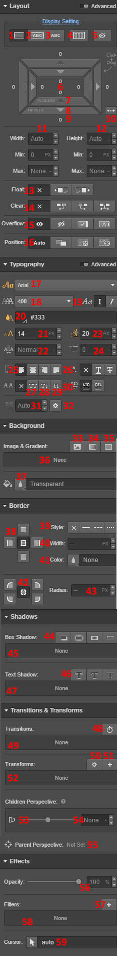
Figure 18: Class Options
Pages
If you click on pages, it will show you a list of pages currently on your website. For the non-home pages, you can choose the URL for this page on your site with the “slug” option. This means that that page will appear as MySiteName.com/slug. A free plan can only have two different pages.
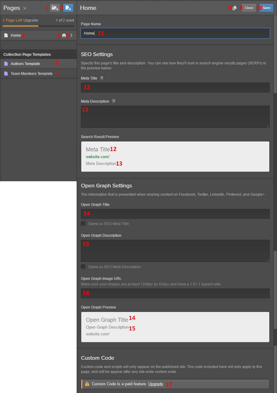
Figure 19: Page Settings
- Add a new folder in which to categorise your pages.
- Add a new page.
- Your pages are displayed here.
- This indicates which page is your home page.
- This is where your settings options are located. Click on them to get the menu at right.
- Edit the “authors” template, from which you can easily build a page of the style you choose.
- Edit the “Team Members” template.
- Create a duplicate of this page.
- Close this page editing menu.
- Save the changes you’ve made to this page.
- Change the page’s name.
- Change the title of this page as it will appear in a search engine results page.
- Change the description of this page as it will appear in a search engine results page.
- Change the open graph title (how it appears when you share content on social media).
- Change the open graph description for social media.
- Change the image associated with the page when it is shared on social media.
- Add custom code and scripts to your page (only available for paid plans).
Collections
A collection is a group of data with fields that you are able to define. Once the content is created, you can display it however you see fit. You can modify the collection name, URL, and fields in the collection. You can add: plain text, rich text, image, video, link, number, date/time, switch, color, options (dropdown menu), reference, and multi-reference. You effectively are creating a form that collaborators will use when creating a new item in the collection. There are also default collection templates: blog posts, authors, categories, projects, clients, team members, listings, events, menu items, songs, shows, and recipes. This decides default structure for each item and the fields that appear in it. An editor for your collection will preview at right to show you the form.
Once you’ve created a collection, you can then add items to your collection using the form. When you choose to create a new one, it will ask you to fill out the form you just chose to create. Once an item has been created, it will tell you when it was first created, and when it was last edited, and by whom. You can choose to archive, delete, or duplicate the item. You can then display these items on your page using “dynamic list”, as previously discussed.
To learn more about creating collections, you can view the video here: https://help.webflow.com/lesson/how-to-create-a-collection.
Navigator
This lets you view the items on your page and their classes. If you have a “wrapper” item that contains several other elements, it will appear as a drop-down list under which you can view each of the individual elements. Clicking on any of the element tabs will select that element for you.
Style Manager
From here, you can manage different classes you have created. You can also choose to “clean up” any elements that do not belong to any page elements. You can also choose the wrench icon next to any class to re-name that class.
Objects
From here, you can add symbols and interactions to your global objects. If you select an element, you can choose to associate a symbol with that element. You can also choose to unlink an element from that symbol. This permits you to re-use any symbols you have created across your site. If you would like to learn more about elements, go here: https://www.google.com/webhp?sourceid=chrome-instant&ion=1&espv=2&ie=UTF-8#q=webflow%20symbols.
You can also add an interaction to a selected element. You can choose to name it, change its initial appearance (adding a title, transforms, width/height, and background gradient to your block, inline block, inline, and flex elements. You can also add triggers that cause the change in appearance. These triggers are: load, scroll, click, hover, tabs, slider, navbar, and dropdown. You can also add multiple interactions to the same element that get activated upon different triggers.
Assets
From here, you can view all of your uploaded media items. You can modify how they are displayed and the sorting method. You can also choose to upload new media items, as well as click on the image to view its image details (and delete the uploaded media if you so choose).
Editor
Once you publish your website, you can use the editor function. This displays a live view of your recently published web page. There are also some modification capabilities. For example, if you double-click on a text block, you can modify the text. At the bottom of your page, you also have tabs for your pages and collections. You also have the capability to publish again. Finally, if you click on the Webflow logo, you can go back to the Style editor.
Site Settings
From here, you can modify various things about your web page.
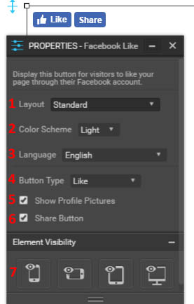
Figure 20: Site Settings
- Open a live version of your website.
- Transfer this website to another person.
- Delete this website.
- Duplicate this website.
- Unpublish this website.
- Share your website with a read-only link.
- Enter designer view.
- Enter editor view.
- Publish the current version of your website.
- View the website settings. You can showcase this website, which will make it appear on your profile page as well as the Discover page on Webflow. You can change the website’s name, as well as the subdomain on the Webflow site (mysite.webflow.io). You can modify your favicon (which appears next to your URL) and your webclip (what appears when saved on an iPhone home screen). You can also change your site’s time zone.
- Modify the CMS settings. Once you’ve set up CMS hosting, this allows you to set up CMS hosting to allow a team to edit the webpage. You can also choose to pay for editor branding, which lets you replace Webflow logos with that of your company. This feature is $10 per month for starter and personal plans, and $5 per month on professional and team plans (per web site you wish to use this feature on). You can also choose to add collaborators. One is free, and the rest cost $6 per month. Collaborators are able to add and edit site content.
- This allows you to set up hosting so you can have a custom domain name. You can also set up 301 redirects from old URLs if you have hosting. You can also add password protection (if you have a professional or team plan), and modify publishing options (if you have a professional or team plan).
- Modify your billing information. You can choose to bill a client instead if you so choose.
- Modify your search engine optimisation and open graph information. You can also choose to disable Webflow subdomain indexing. Finally, you can auto-generate a sitemap and choose the custom sitemap.xml page.
- This lets you modify your form submission if you have a professional plan. You can also choose how form submission is notified to you (the email they are sent to, the subject line, and the email template). Here is also where you view form submission data.
- View the current collection of Google Fonts, or upload custom font files for use on your website. You can also upload Typekit API keysets.
- View the backups and previous versions of your site. It tells you the number of pages, styles, and elements. You can also preview these versions, as well as restore them to become the current version of your web page.
- Input your Google Analytics ID if you have a google analytics account. You can also input your Google site verification code on this page.
- Add custom code to your webpage. You can change the header, footer, language code, base tag, and href prefix here.
Dashboard
You can also reach the dashboard by selecting “Dashboard” next to the Webflow logo. From here, you can view all websites associated with the account you are currently logged into.
Summary
Overall, Webflow is a great site that offers a huge amount of customisation. Its customisation level is similar to that of Webnode, but allows you to use similar features at a free or much lower cost. However, one issue is it is a lot less intuitive than Webflow. It takes a bit more background knowledge of HTML, as opposed to Webnode which requires a familiarity with Photoshop for ultimate utility. Since it’s a lot harder to drag and drop items where you want them on the page, it can be a bit difficult to get use to the placement, and because most customisation requires classes, it can be challenging to get acquainted with this system. However, if you want to fine tune detailed aspects of your page, but don’t have a lot of money to spend, this may be a good website building alternative to Webnode. If you want to use a simple and intuitive website builder, something else may be ideal for you.