 Connect
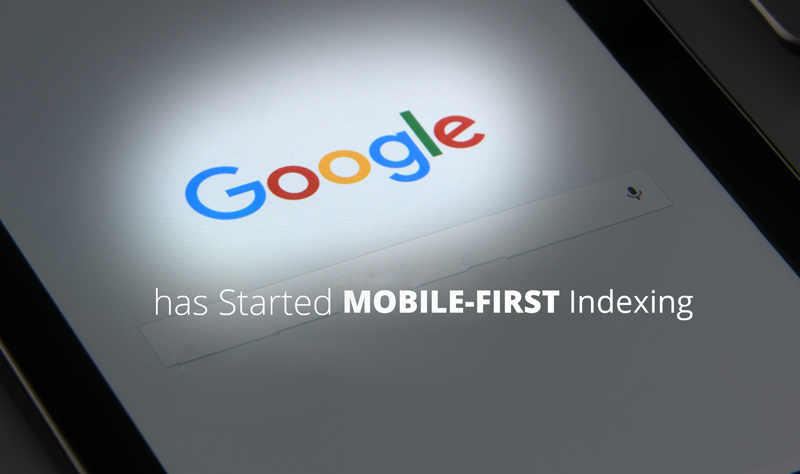
Have you heard? Google has indicated that a website being mobile-friendly will receive a ranking boost in the search engine results pages.
What does this mean for you?
If your website is not mobile friendly, you’re losing out on an advantage that your competitors have.
What is mobile first design?
Mobile first design turns the tables on traditional responsive design (another term for the design practice to make a website mobile friendly).
Instead of designing a website to look great on a desktop computer, and then adapting the design as it reduces down to tablet and mobile-sized browsers, mobile first, as its name implies, designs the mobile experience first, progressively adding enhancements as more screen space becomes available on tablet and then desktop.
The idea is that when you start from a mobile design first, the design receives much more attention than would normally be the case when it is at the end of a desktop-first design process, producing a better website on mobile devices, retaining mobile visitors longer, reducing your bounce rate, and improving your search engine rankings.
Grab the free e-book "How to Write Copy That People AND Search Engines LOVE" so you can keep people on your page and rank highly on Google
If you would like some more information on how to leverage the latest trends for your business, contact Steve at insight.web@insightdesign.com.au or call 08 9381 5900
.